Got-it: Plan trips together
- Collaborators
- Planète Aventure
- Timeline
- 2 months
- Scope
- Product DesignBranding and MotionLanding Page
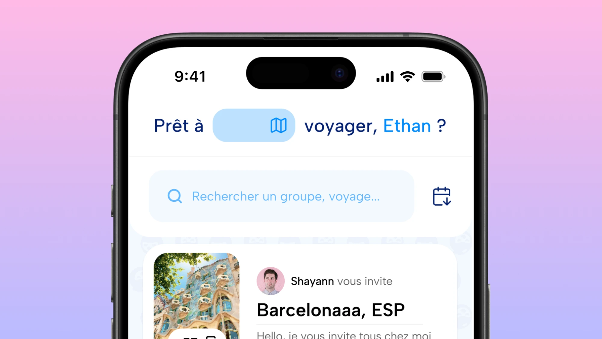
I designed Got-it, a free app that brings a whole group trip together: the map, the chat, the budget and the memories. Two months, solo, with a group-travel agency, for my end-of-studies project, which earned me the jury's top grade.
Context
Organizing a trip with friends is rarely hard because of the destination.
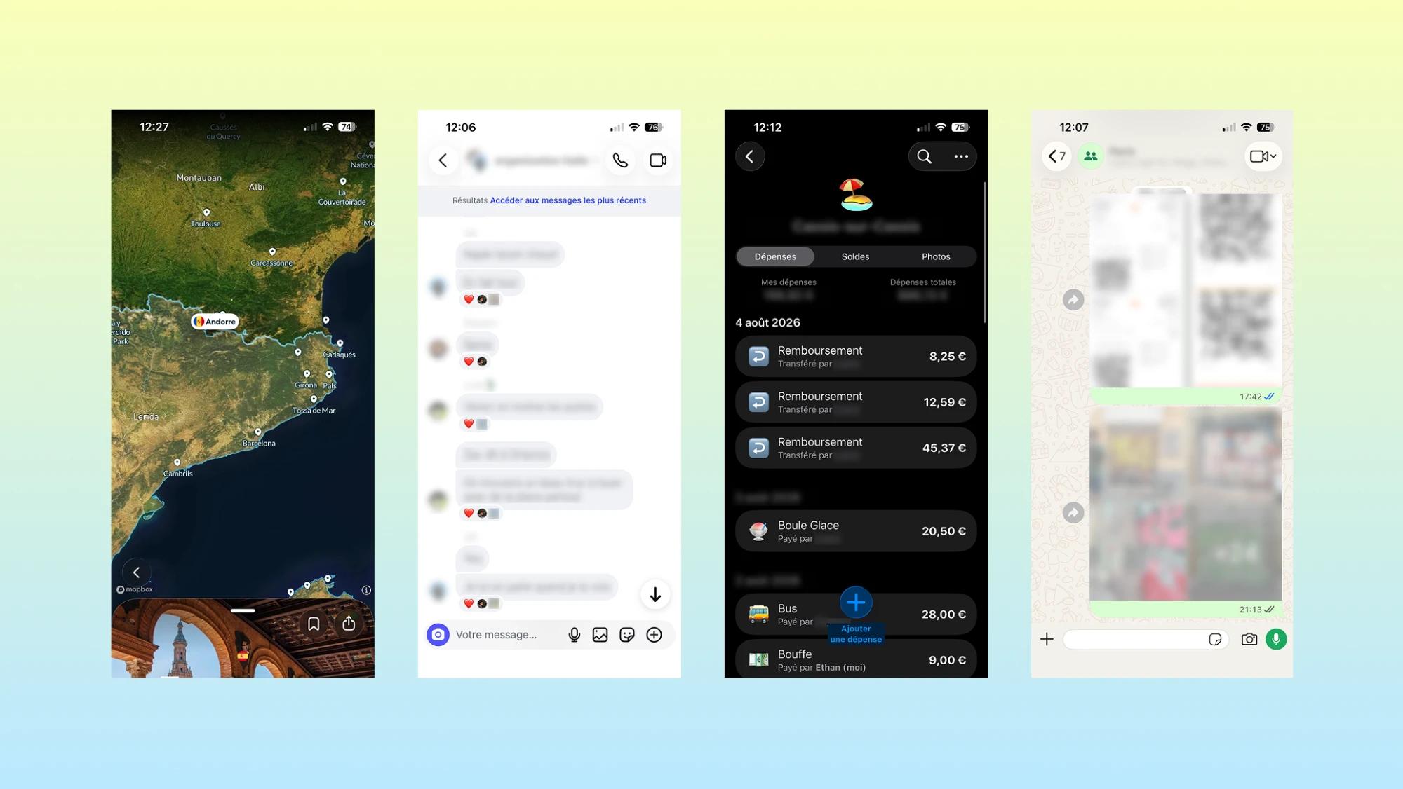
It is hard because everything ends up scattered. Got-it started with a trip of exactly that kind. Seven of us drove to Barcelona to see a friend who was studying there. To organize it, we used a group chat, a shared map link, a spreadsheet to track who paid for what, and a Snapchat group to keep the photos. Four tools for one trip, and we still couldn't agree on where to eat. That trip gave the project its name: Got-it plays on "I've got it", the feeling of finally having the whole trip in one place.
Challenges
I took it on as my end-of-studies project, with three constraints that shaped everything: two months, solo, and an app that had to stay free for its users. The question I started from: what if a single app held the whole group trip?
Two things kept coming back.
- Every piece of a group trip lives in a different app, so nobody really knows what the rest of the group plans to do.
- The free travel apps that exist each solve one problem and ignore the others: a map app like Polarstep follows a route, a cost-splitting app like Tricount follows a bill, and none treats a group trip as both.
To go beyond my own guesses, I partnered with Planète Aventure, a group-travel agency with more than fifteen years of experience. I interviewed its two directors and about five past travelers to understand the recurring friction.
Generally, in the groups we hosted (5 to 6 people), there were always two or three who had absolutely no idea what they were going to do, and were therefore surprised, sometimes taken aback, by the activities we offered (very often quite sporty), which could create some tension.
From these conversations we drew one overall finding: disagreement was rarely the real problem. The "leader" of the group, the member who ended up organizing the trip, became the default decision-maker for everything after that, chasing confirmations and settling every open question alone, often exhausted before the trip had even started.
Two surveys point the same way.
60.8%
of travel planners say the trip only makes it out of the group chat because of their own effort.
Klook survey, United States, August 2026
45%
of group travelers had experienced financial conflict or discomfort on a trip: money is the other sore point.
Harris Poll for CIT Bank, 2,067 American adults, May 2026
7 people:
- 2 directors of Planète Aventure
- 5 past travelers
Ethan THIERY
3 findings:
- Few real disagreements. Disagreement was only rarely the real problem in the group.
- A default leader. The group’s “leader”, whoever ends up organizing, decides everything else, and some group members lose the thread.
- An “exhausted” group leader chases confirmations and settles every open question alone, which adds to the lack of communication about information.
Ethan THIERY
Solution: let a group line up easily on every aspect of the experience.
Ethan THIERY
Approach
I split my two months into three stretches.
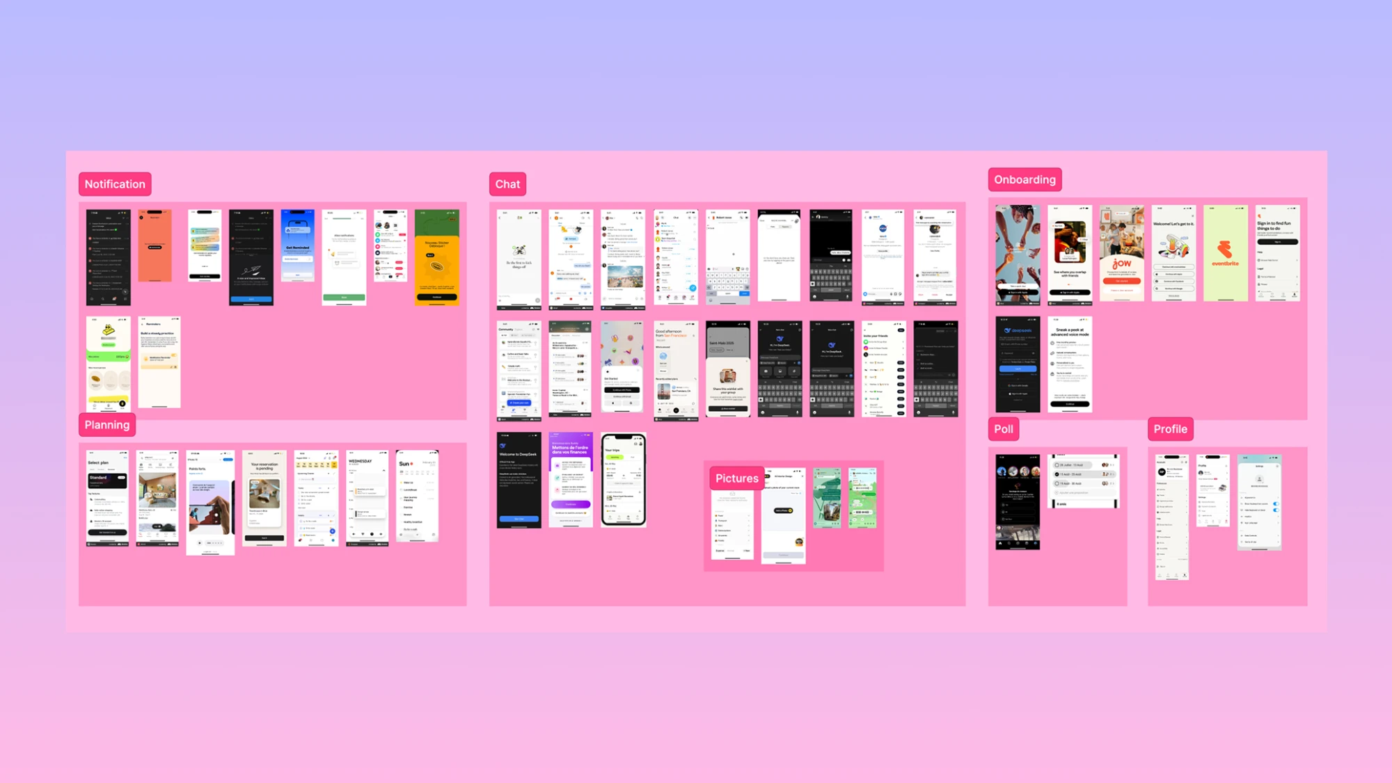
Before designing, I sorted what already existed into three families.
Live trip tracking
Like Polarstep, it nails the map but is made for one traveler.
Group planning
Like Wanderlog or TripIt, it handles logistics but locks the group features behind a paywall.
Group mechanics
Borrowed from outside travel: Instagram's close-friends invites, Snapchat's memory map, Tricount to split a bill.
What really works for groups was not in travel apps at all.
That led to the question that guided the whole project: how might a single free app borrow the map from Polarstep, the intimacy of a group chat and the memory layer of Snapchat, without charging a subscription?
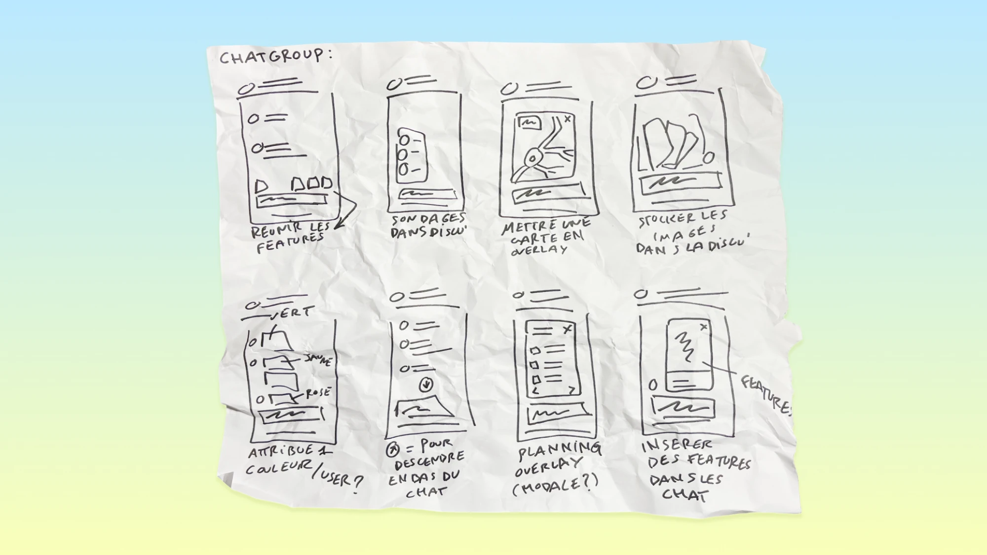
I then sketched interfaces and features, with techniques like Crazy 8, before showing and explaining them. That brought out one clear insight: in a group, communication is the key, so it should sit at the center of the experience. It's easy to overlook, and it shaped the whole structure of the app.
Solution
The group chat became the spine of the whole app.
That came straight from the sketching sessions: in a group, communication is the key. Everything else is built around it, so nothing gets decided out of the group's sight.
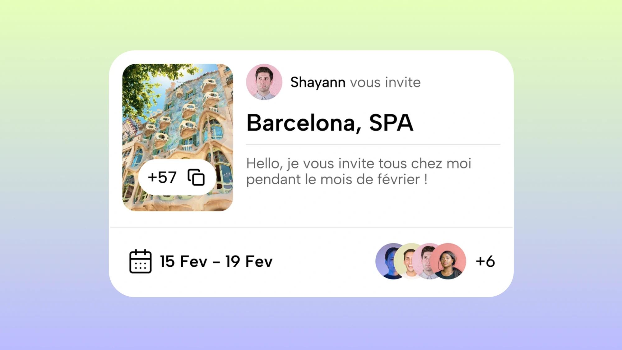
Got-it lets you create one group per trip and add all your friends through a shareable link. Each user gets a color, which they can change, so you can tell who said what.
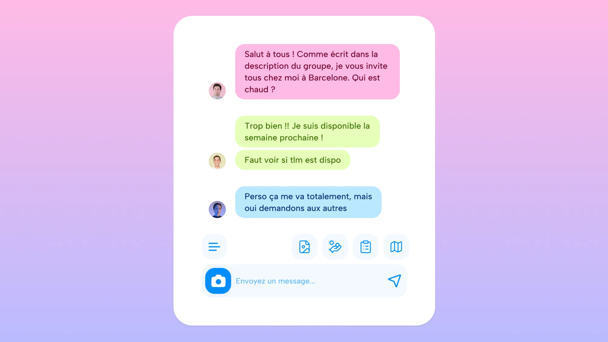
Around the group's input field sits everything a group of friends needs to prepare a trip and find their way once there, each piece answering a pain point we had found:
- A shared itinerary, so the two or three who had no idea what was coming know what is planned.
- Expense sharing, so money never turns into an awkward conversation.
- Polls, so decisions stop falling on the organizer alone.
- Photos in the chat, so the memories stay where the trip was organized.
- An interactive map, so everyone sees the same places.
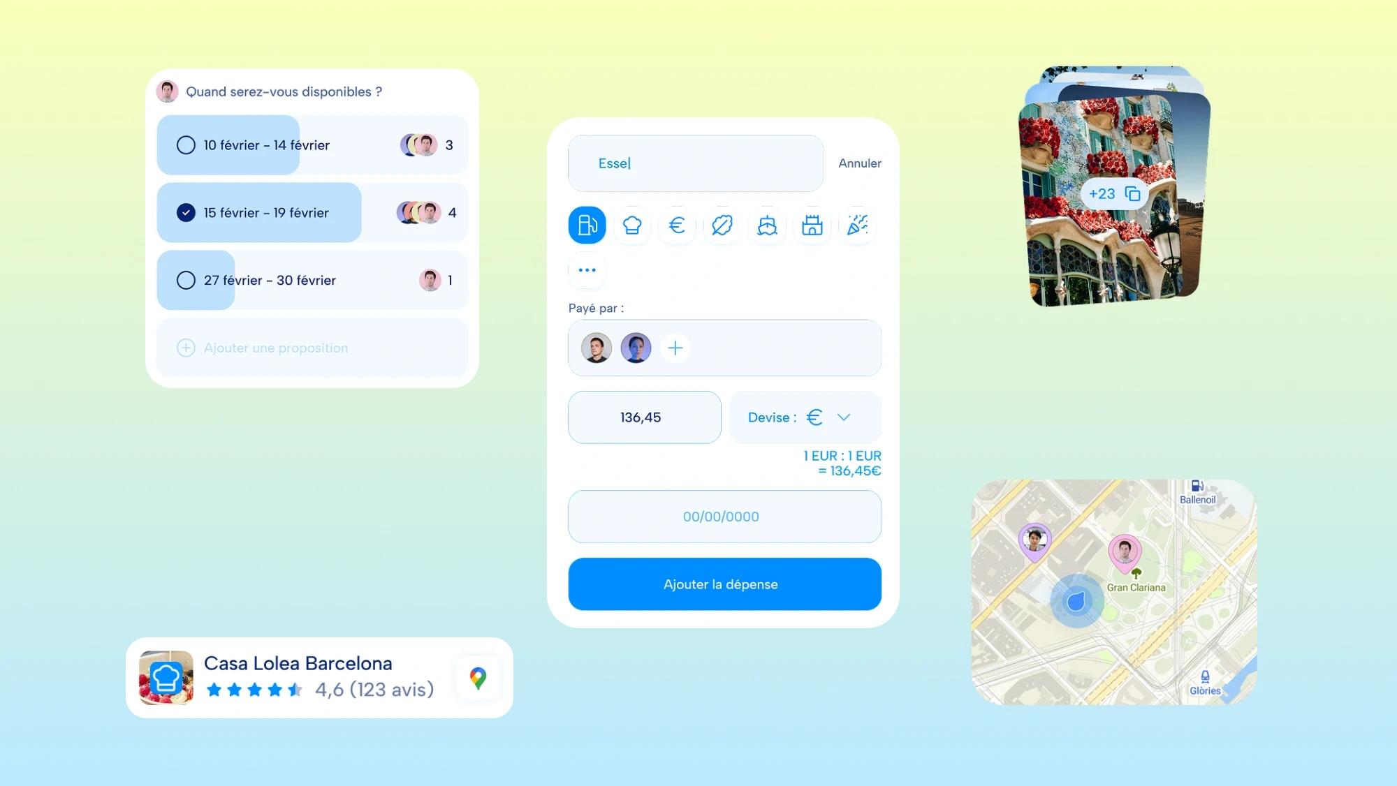
To keep it free, Got-it takes a small commission when the group books a hotel, a restaurant or an experience straight from the map, the same referral model as The Fork: the venue gets a customer, the group discovers a place worth visiting, and Got-it earns its keep without charging either side directly.
Before leaving
A week before departure, one of us creates the group and sends the invite link. Everyone joins and gets a color, and the chat fills up quickly: a poll for the Friday departure time, and pins on the places each of us wants to visit, with a few restaurants added by the friend who lives there.
On site
Once there, the expenses go in as we go. The first one is entered the evening we arrive: a round of drinks paid by Antoine, split across the seven of us without anyone doing the math. Every expense after that adds to the same running total, so nobody has to ask who owes whom on the last day.
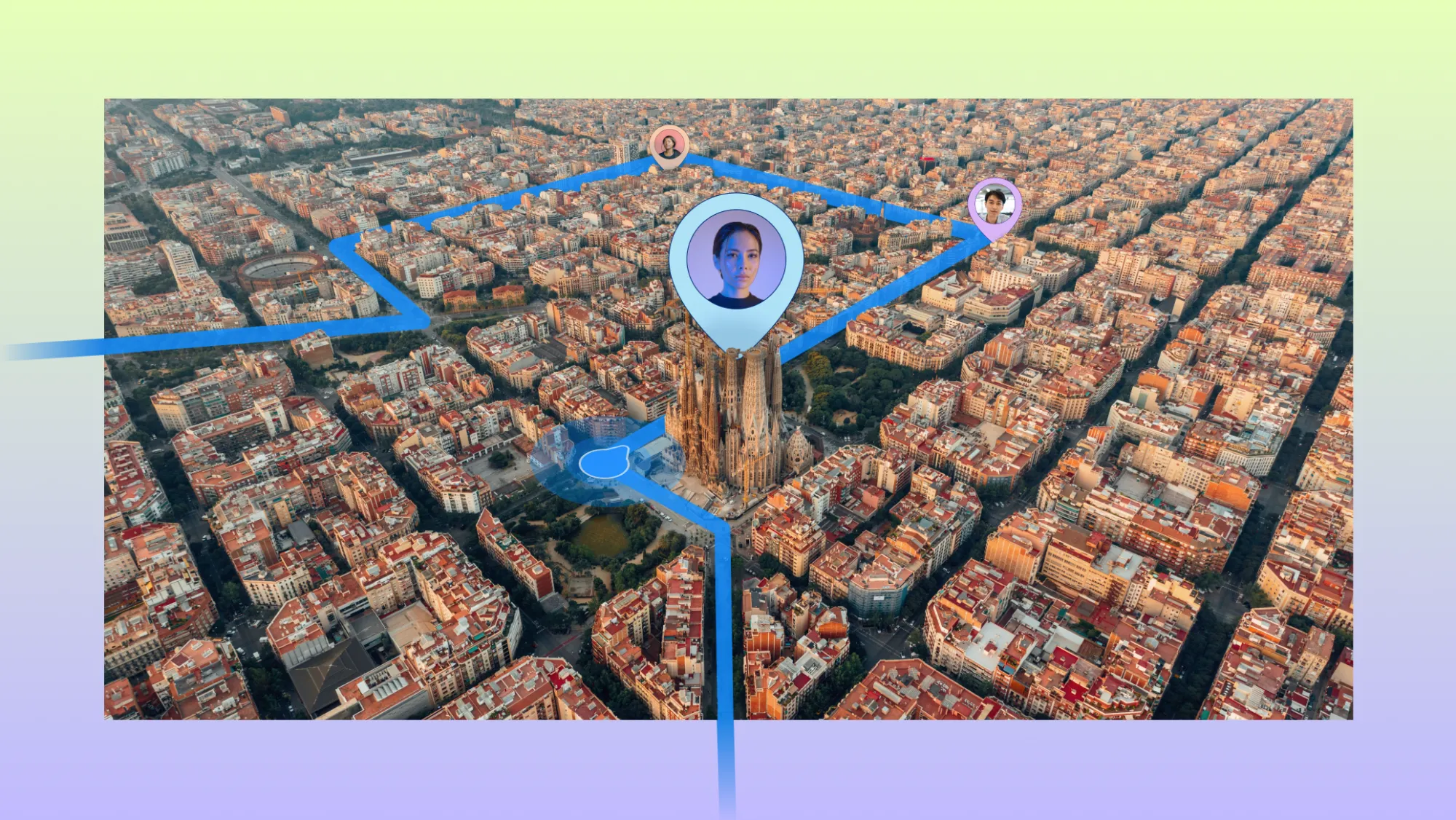
During the trip, the map comes alive. Our friend who lives there had pinned the Sagrada Familia, so when one of us gets close, their phone buzzes: "You're near the Sagrada Familia that Jules pinned". We even book the closing dinner straight from the map, the one moment Got-it earns its commission without anyone paying extra.
Back home
Once the trip is over, everyone adds their photos to the chat. A few days later we open the app again, not to plan anything but to look back on every street we walked through and every address we visited.
Visual identity
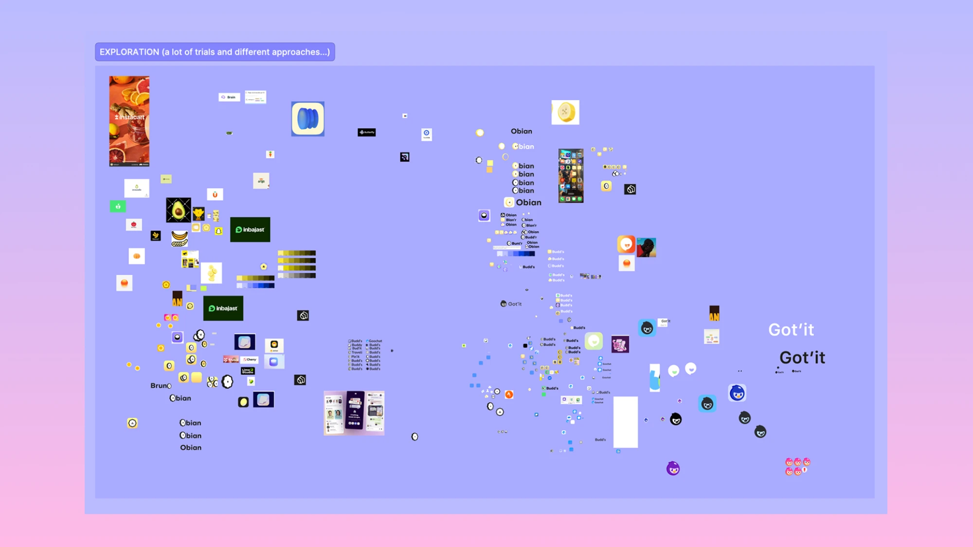
The mascot
It took quite a few iterations to reach the final look. I first designed around a banana, a joyful yellow like the fanny pack I take on every trip (in French, a "sac banane"), the one pocket that holds exactly what you need. I also thought of an orange, which splits into segments yet holds them under one skin, like Got-it gathers a whole trip in one place. Then I realized a fruit couldn't carry the warmth the app needed.

I finally settled on a bird mascot, which personifies the product and brings empathy. The bird stands for organization (migratory birds find their way remarkably well) and for the freedom and lightness Got-it gives its users: easing the mental load of organizing a trip. Its tuft can also read as an upside-down speech bubble.
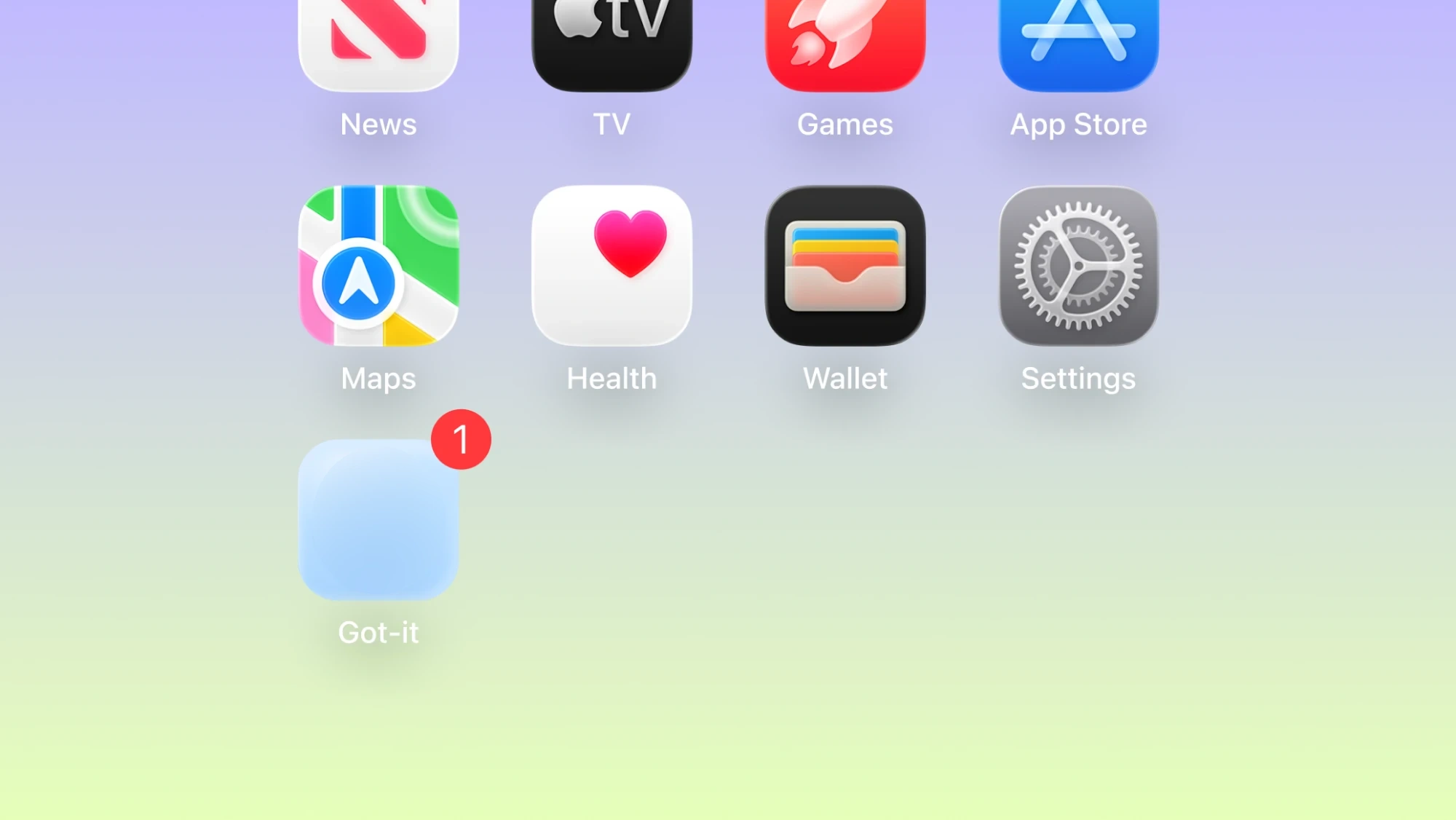
Its blue plumage gives it an exotic side while recalling the seriousness and reliability the app offers.
Colors and motion
The palette follows the same logic: a deep navy for headlines, a bright blue for actions and very light blues for backgrounds and active elements, carried into the landing page and the communication materials.










A recurring detail makes the headlines memorable: a colored pill in which an icon related to the headline slides from left to right. It brings the written information to life and lets you grasp its topic without really reading the words. The same motion runs through the brand and echoes the idea of being on the move, like the app itself.
Marketing and tone
For the tone, I took inspiration from BlaBlaCar, an app I often used as a student, to speak to travelers in a direct, friendly way.
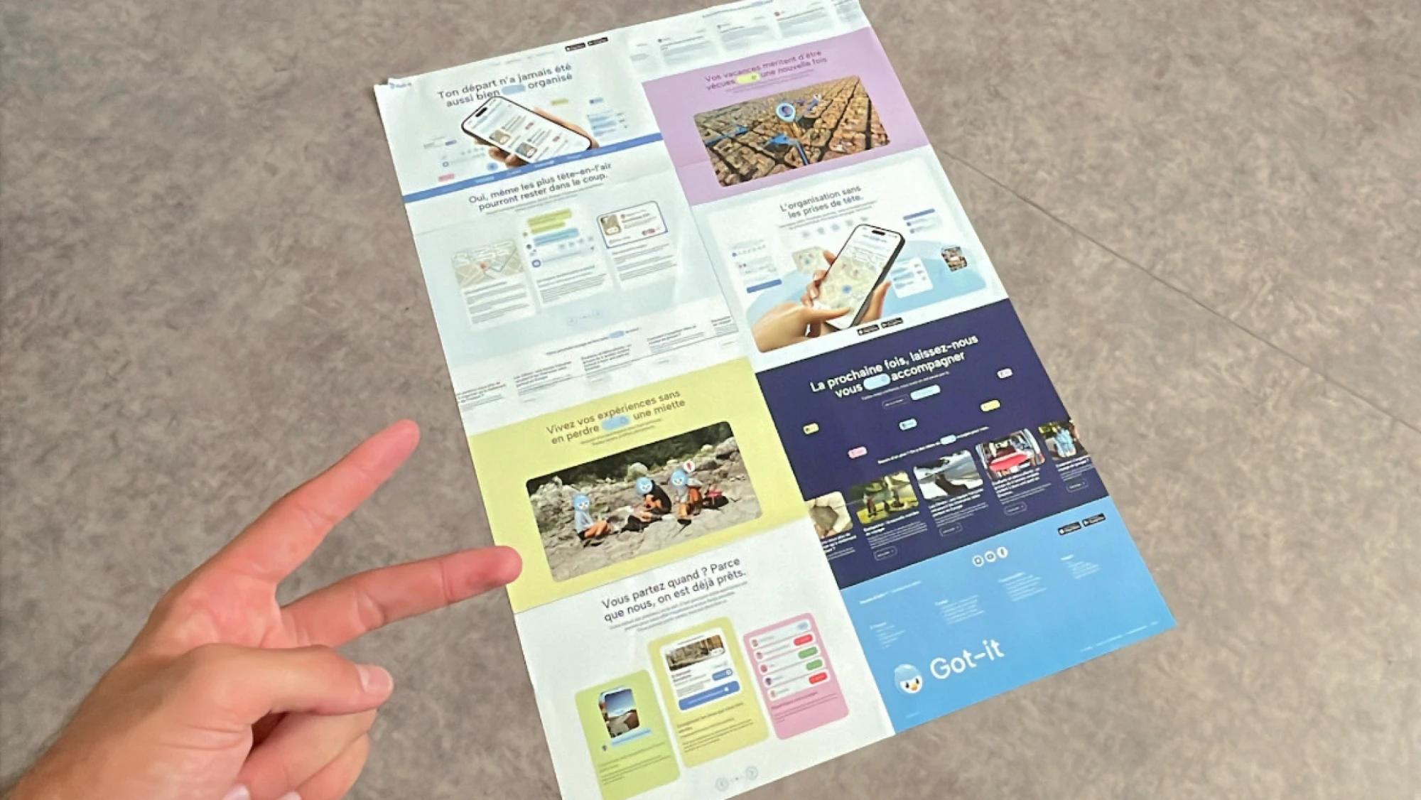
The landing page moves from proof of value to social proof to a call to action: it opens on the group chat under the line "your trip has never been this well organized", then shows the app's strengths and quotes from travelers taken from the research, and closes on "next time, take us along" with the store badges.
Conclusion
I presented Got-it to the end-of-studies jury as the final deliverable of the program, and I got the best possible grade. I was named top of my class in my final year of the bachelor's degree. The jury appreciated the thinking behind the product and the work I put into it.
Got-it stayed a prototype in my Figma: it was never meant to go further, since the back end would have been complex to build. So I can't say yet whether it solves the problem for a group on a real trip. What I can point to is the direction: a few weeks after my project, Instagram added polls to its group chats, one of the features I had placed at the heart of the app. The next step would be to test it on a real trip, with a group like the one in Barcelona, to see whether the chat really takes the load off the person who organizes everything.
Learnings
I learned not to get attached to a solution until it has been put to the test, and to let the interview data shape the direction of the product.
Sketching several interfaces, then showing and explaining them, is what made that concrete. I also learned that a mascot helps users bond with a product, and brings it emotion and empathy. Carrying the whole project solo in two months taught me above all how to sequence tasks: every week had to unblock the next, because nobody else could catch what slipped. It's the first time I saw sequencing as a design decision, not just a scheduling one.